If you’ve read my previous posts, you probably know that by this stage of my fountain pen journey, I was adding pens that were incrementally more expensive (and hopefully slightly better) than my previous purchases. In retrospect, what I hoped to achieve by taking such an arbitrary course of action, I do not know.
You see, it took a while and I made a few mistakes along the way, but what I have learnt is that, generally speaking, the cost of something is not an accurate indication of its value – I’ll stop channelling my inner Oscar Wilde now; the sense of enjoyment it imparts; or how used it will be. If the Lamy Safari was the gateway for me starting to collect fountain pens, the Sailor 1911 Young (formerly called the Somiko) was the pen that made me realise that paying more doesn’t always get you a better pen.
Purchase price
£60 (Cult Pens)
Essentials
Capped: 13.5cm, Posted: 14.5cm, Weight: 15g
Looks
I’ll admit it now, but when I first opened the box and took out the Sailor 1911 Young, I was underwhelmed. Perhaps that is a little unfair, considering I chose it and had seen pictures of it before purchasing it, but I remember uttering a ‘meh’ immediately after unboxing this pen. I had read about Sailor pens, had high expectations and felt, well, a bit cheated.
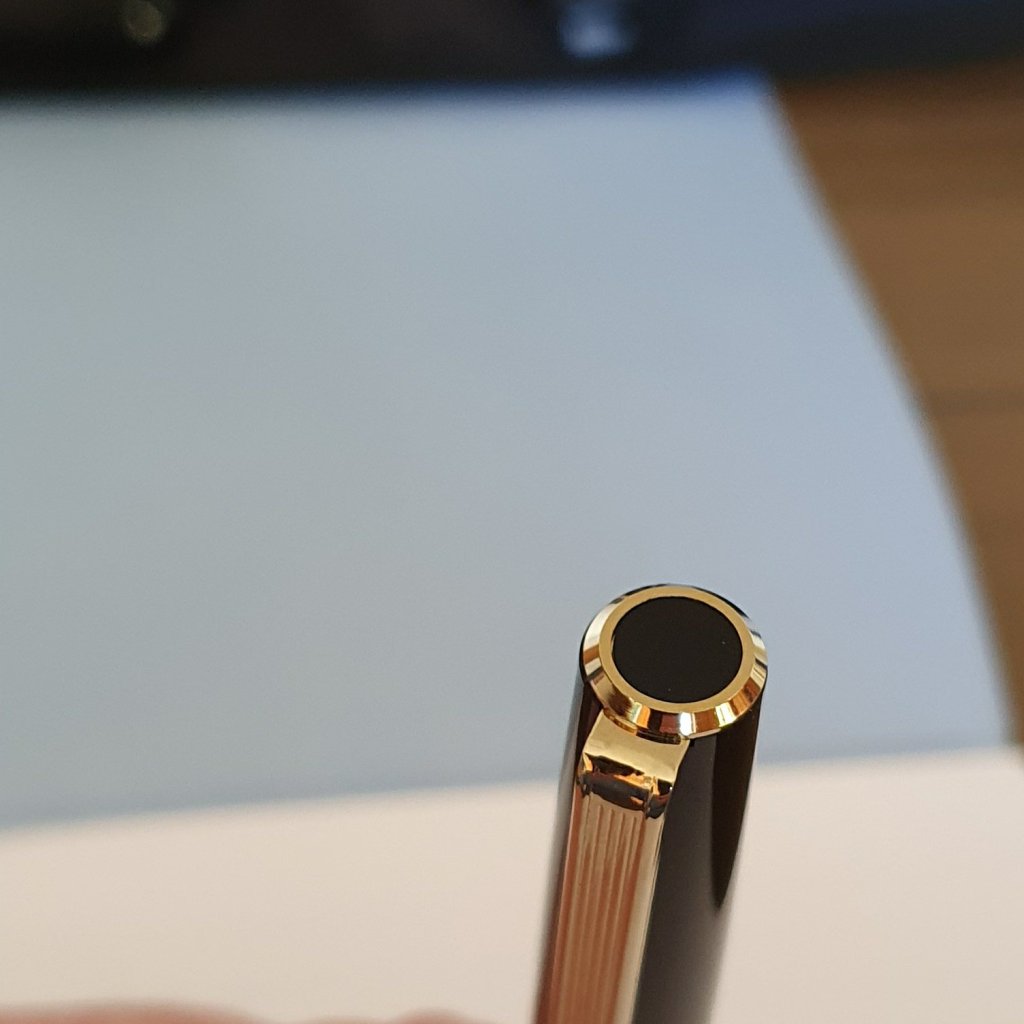
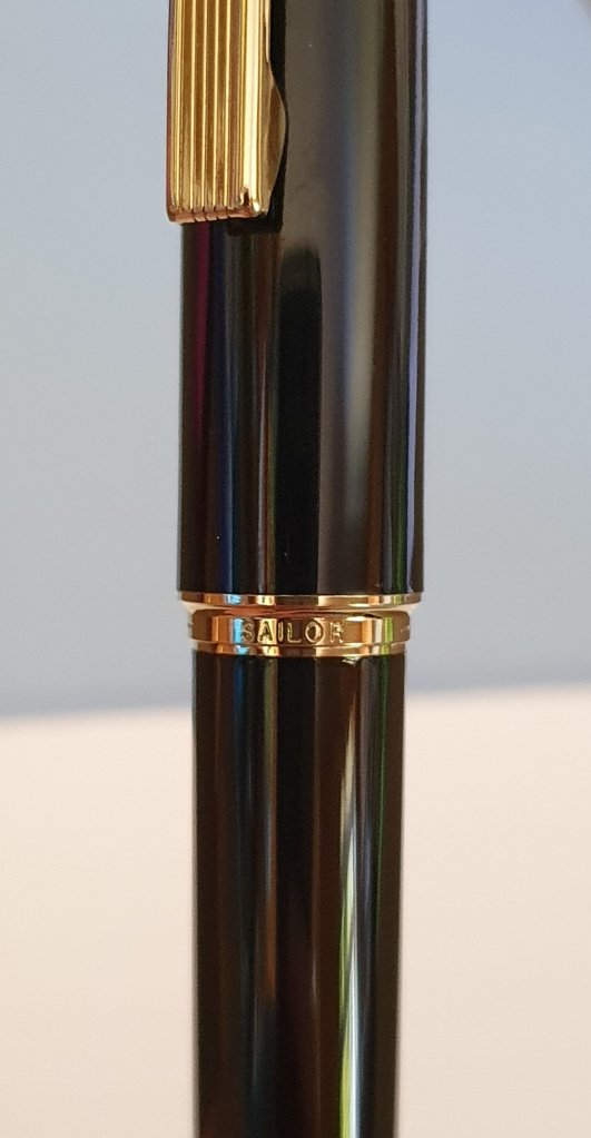
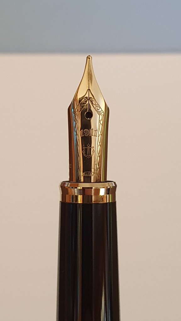
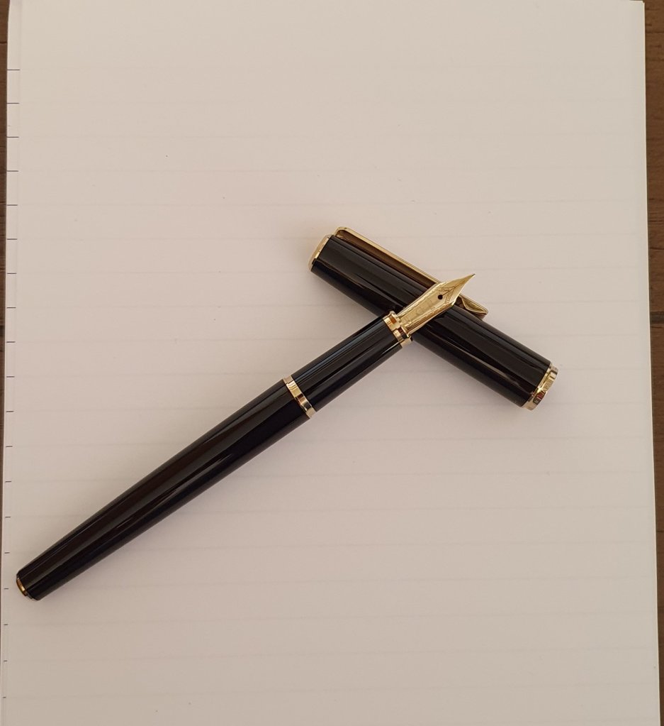
A black, slightly tapered pen that flattens out at the top of the cap and the bottom of the barrel, the design is conservative and minimalist. I opted for the gold version, so this version has gold trims as well as a gold plated steel nib. As such, the pen is complemented with gold finial rings with inlaid black discs at the top of the cap and at the bottom of the barrel, a gold trim ring and a gold finial at the end of the grip section. This is all tastefully done. While this pen doesn’t exactly scream uniqueness, it does not look cheap. The grip section is fairly long, which will be good news for larger fingered writers, but is otherwise unremarkable.
The click cap is fairly nice, but requires a bit of force to remove- probably more than I like in all honesty. The clip functions as intended, rather than being merely an object d’art, and is a plain, slightly rounded rectangular affair with straight vertical lines etched into it. It is somewhat stiff. The centre band of the cap is also gold and has ‘Sailor’ etched in. The cap is fully postable, and the 1911 Young is well balanced posted or unposted.
This pen looks classy, it is minimalistic and fairly inoffensive in design, so given that, you may well be wondering why I was rather disappointed when initially unboxing it. There are two main reasons.
Firstly, the barrel is strangely thin. I find gauging girth difficult (innuendo not intended, you child). I mean, if someone writes that a pen is 15cm long, I have a mental imagine of that size. Likewise, if I see that a nib is 6mm wide, I have a pretty good idea of the width. But I find circumference measurements to be meaningless, so I tend to overlook them. Anyway, I digress. Suffice to say the Sailor 1911 Young is a thin pen and I don’t get down with thin pens.
My biggest issue with the pen, however, is that although the 1911 Young (why can’t they have continued to use Somiko as a name?) looks classy, it feels cheap. Specifically, the resin feels cheap. It is the sort of plastic that makes you think a misplaced book, or an inopportune roll from a desk could crack. And, fundamentally, it doesn’t feel right in the hand. It isn’t delicate, ‘oh, I’d better be careful with this’ resin, it’s cheap resin. How a pen feels in the hand plays as important a part as how it writes, or how it looks, when it comes to enjoyment.
Writing & filling
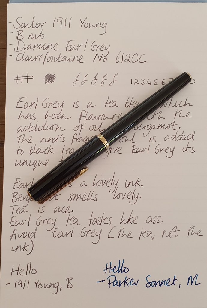
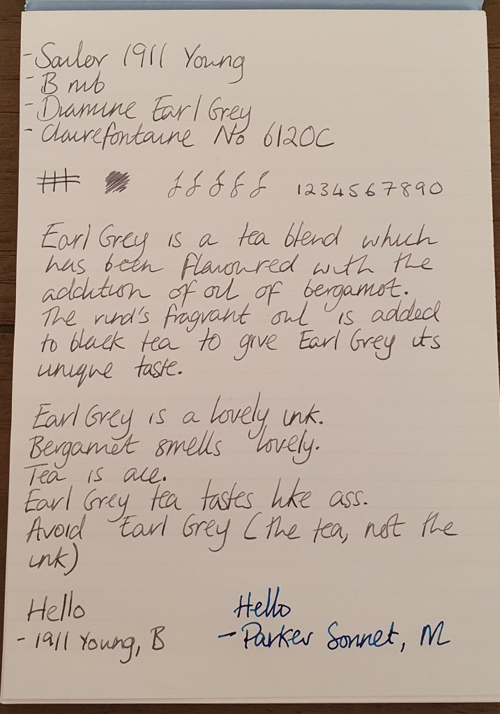
The first thing to say about the nib is that it looks small. It doesn’t look disproportionately small, but it is on the smaller size. There is some nice decorative work on the nib, with the Sailor anchor logo and some scroll work adorning it. Having heard that Japanese nibs in general, and Sailor nibs I’m particular, run narrower than Western nibs, I opted for a broad nib. This proved to be the correct choice for me with the nib being equivalent to a German medium, more or less. The 1911 Young is available in F,M & B.
Out of the box, the pen wrote well. In fact, it is probably the one thing that saved this pen from being returned. It’s a smooth writer, there is just a hint of pleasant feedback to it. The gold plated nib adds a touch of springiness to writing, but nothing major. It is certainly not one to try to flex or push, neither is it a nail. One thing I did notice is that the flow was on the dry side, not that the pen ever dried up when writing, but it is by no means a gusher.
The 1911 Young is a cartridge converter and takes either Sailor cartridges or bottled ink from a converter. The converter is fairly standard but decent, with a smooth piston and a respectable 1.2ml capacity.
Conclusions
This isn’t a tough one to call. When I use the 1911 Young, I enjoy writing with the nib. It is a nice nib to use. The pen also looks nice, its design is unlikely to offend and the cartridge has decent capacity, so there is no need to worry about running out of ink during the day. Although first impressions count, I used this pen as my daily work pen for well over a month after purchasing it. I wanted to give it the benefit of the doubt. Being the person in the office who uses fountain pens, my colleagues often ask to use my pens. “I don’t think as much of this as I do your others.”, was a constant refrain. As I have said before, tactility is a huge part of the enjoyment derived from using fountain pens, and this one feels cheap. I look at the tasteful design, and the garnishes that Sailor applied and that’s at odds with the pen’s feel. It’s as though the design team at Sailor were given a budget, which was subsequently slashed. I feel that the designers wanted people to love this pen, but were constrained from fulfilling their vision. (There is no evidential grounding for this theory, by the way).
It is really hard to recommend the 1911 Young, given that similarly – or even lower – priced options are better choices. While the nib is good, it is by no means stellar, and it simply isn’t enough to make one overlook the cheaply constructed feel. Fundamentally, I do not know what Sailor were thinking releasing this pen. The Shikiori exists in this space, and choice of nib sizes aside, is a better pen. I think even the cheaper Lecoule has more going for it than than the 1911 Young. Were the Sailor 1911 Young half the price, it might be a better proposition, but it isn’t.
Alternatives
Sailor Shikiori – more traditional Sailor shape, nicer feel in hand, some very good look variants available. Only comes with an F nib.
Platinum PGB 3000A – transparent cigar shaped body pen from Platinum. Steel nibbed. Almost half the price of the 1911 Young.
Platinum PTL 5000 – Similar size and look to the 1911 Young, lightweight, nicer feeling resin. Comes with 14k gold nib. Slightly more expensive.
