Pretty soon after I had bought a Lamy Safari, I bought the compatible converter that allows one to use bottled ink in a fountain pen, rather than cartridges. As I discussed in an earlier post, Lamy’s standard range of ink cartridges come in 7 colours.
This might seem a lot, especially when you are coming from a ballpoint, but once you have seen the literally thousands of colour choices available via bottled ink, you feel a little bit like you are missing out by not having access to the amazing range of colour available in bottled ink. At least I did. Besides which, bottled ink is more environmentally friendly and often works out cheaper per ml. What’s the catch? Well, if you are a heavy writer and you run out of ink mid sentence, you’re kind of stuck – unless you happened to bring an ink bottle and some kitchen roll (there’s always mess) with you. It’s a trade off I have been willing to pay, not that I routinely leave the house with bottles of ink.
So, having decided to go down the route of using bottled ink and having purchased a converter, what does one do, exactly? It’s pretty simple, there are two main ways of using a converter:
- Attach the converter to the nib unit, dunk the nib unit and converter in the bottle of ink so that the nib is immersed in ink and then proceed to fill – usually by twisting the small nob on the converter. There are some minor variations to this, the Kaweco mini piston converter works by a plunger that is pulled and the Pilot CON-70 has a button, for example, but the most common type of converter is a twist converter.
- Place the converter into the bottle of ink directly, and then proceed to fill the converter with ink before attaching the converter to the pen’s nib unit.
Generally speaking, I use the first option as repeated removal and reattachment of converters can damage the seal between the converter and the nib unit, in some cases. However, with some pens, the second method has to be used. Yes, I am looking at you, Platinum Plaisir. On the whole, though, using bottled ink really is remarkably simple.
Choices, choices or lack thereof
The only real difficulty is choosing which ink to use. Although I am based in Ireland, I do not hail from these shores originally. Like any ex-pat living in a ‘foreign’ country, I have my gripes, notice differences and compare life here to life at home (and other countries in which I have lived).
Do not fear, dear reader, I am not about to go off on a tangent, I only mention this as a segue into stating that while blessed with many qualities, good online stationery retailers is not something Ireland is really possessed with. To my knowledge, save from a couple of jewellery retailers offering Cross or Montblanc pens, a couple of Paperchase concessions and two bricks and mortar stores in Dublin (one without a website, the other with no real e-commerce facility), there is no real online presence of stationery shops.
As I originally come from the UK, I tend to gravitate there for things I cannot purchase here, and with inks it proved to be no different. The short distance and reasonable postage charges were also bonuses.
The Scouse Connection
There are many online stationery retailers in the UK, and all of them are awash (if you’ll pardon the crude pun) with Diamine inks. With a history dating back to 1864, Diamine, who are now located in Liverpool, have been manufacturing high quality inks for years. There are hundreds of colours to chose from and where possible, all the inks are manufactured using traditional methods. In addition to their own label inks, Diamine are exclusive or own brand manufacturers to many more companies.
As well as offering standard inks, Diamine also offer sheen inks (those which are transferred to the page in one colour, but dry so that part, or all, changes to another colour) and shimmer inks (inks containing glittery particles which add a sparkle). Diamine’s Monaco Red colour was as specially formulated for Prince Rainier III of Monaco and their Royal Blue was used by Presidents Obama and Medvedev in the signing of the nuclear arms treaty at Prague Castle in 2010. They have a storied history!
Crucially for me, aside from some limited edition collections or in the case of shimmer inks, Diamine is available in 30ml bottles, which is a perfect size for testing the waters I feel. Obviously, many retailers also offer samples of ink, but I have always worried about really liking an ink and then either having to wait for a bottle to arrive, or worse, for a larger bottle to be out of stock. Admittedly, the latter is not a very realistic scenario, but we all have our foibles! Finally, in Europe at least, the 30ml bottles cost around £2.50-3.00 – a bargain!
As a member of r/fountainpens on Reddit, I had read that Diamine inks were of low quality, but in all honesty after now owning more than 50 bottles of Diamine ink, I can say this has not been my experience at all. Some of my favourite inks are Diamine inks and all of them are well behaved inks.
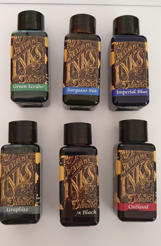
As you might have guessed, I settled on purchasing some Diamine inks. Below, I’ll briefly discuss each one and offer my thoughts on them.
Before I do so, I would like to point out that obviously there are many other inks available and I am particularly fond of Pilot’s Iroshizuku range and KWZ’s inks, amongst others. I chose Diamine as my starter inks because they seemed like a decent punt given their low price point.
All samples were written with a glass dip pen, for reasons of consistency, if nothing else. Excuse the scrawl.
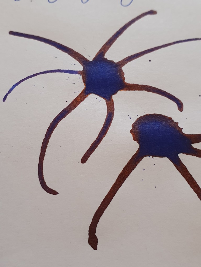
Love at first sight, or Sargasso Sea
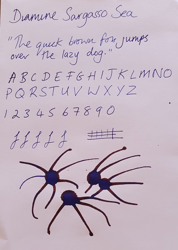
A lovely, rich, dark medium blue, Sargasso Sea has become a firm favourite of mine. It is always inked in at least one of my pens. It is quite a wet ink and flows very well. While it does dry a little differently, I find that the sheen it leaves and the reddish, coppery shading more than compensate for the colour change. It tends to work better in pens with nib thickness of medium upwards. I find it to be quite well behaved, with no feathering (where the ink spreads out) or show through (where you can see the ink on the other side of the paper). Obviously, these qualities depend as much on the paper as on the ink.
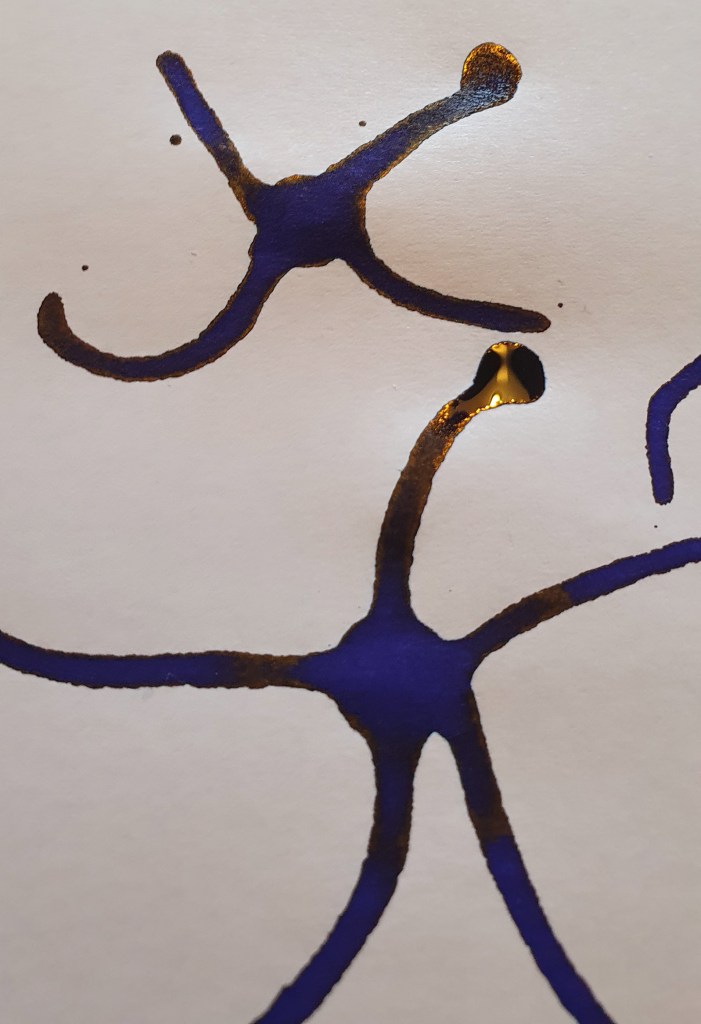
They call it Imperial Blue for a reason
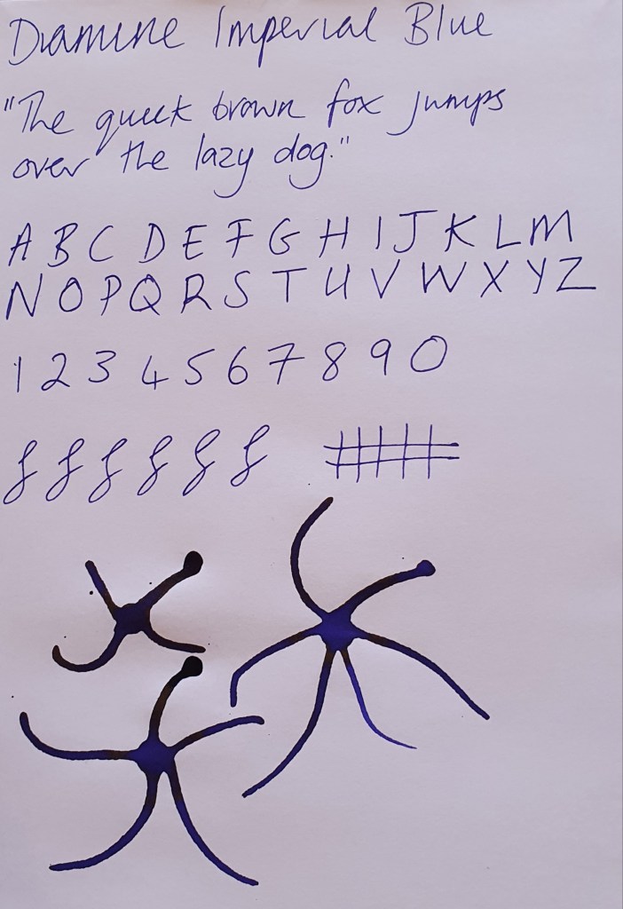
I still don’t quite know how I feel about this ink. There is nothing wrong with it as such. Indeed, the ink is well behaved: it is neither too wet or too dry, it doesn’t feather, doesn’t show through and doesn’t stain. It’s just, I’m not keen on what is called ‘blurple’ – a self explanatory portmanteau of blue and purple. I love blue inks, it’s probably my favourite colour ink; I also like purple inks, too. It’s just, I don’t like blurple. On the other hand, the golden sheen it possesses is just amazing. It’s not a heavy sheener, but its subtlety makes it that little bit more special. Sometimes the clue isn’t in the title, but in this one it was.
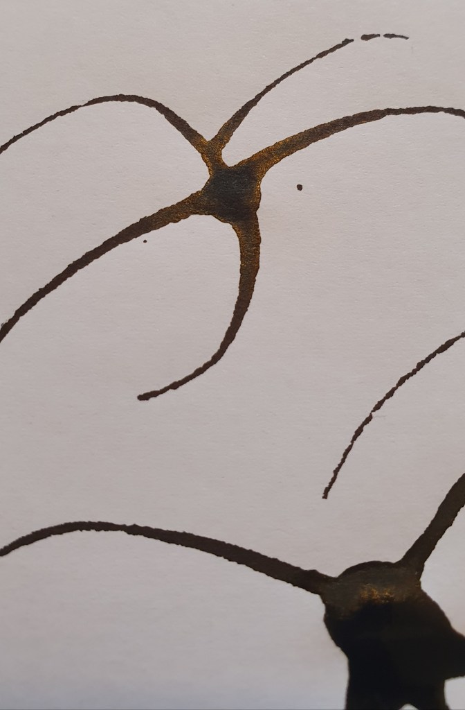
Is black, black?
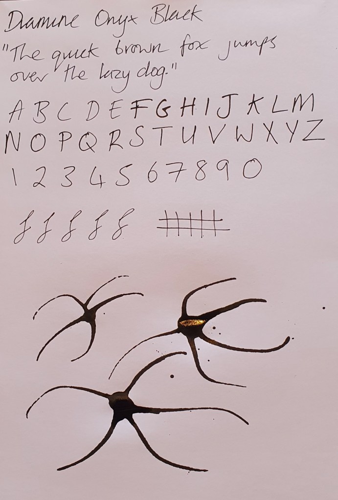
Is black always black? One of the strange things about collecting fountain pen inks is that you become more aware of the differences between different colours. Pre-fountain pen me might have noticed that a particular pen’s colour was different to another brand’s corresponding colour, I may even have noticed that some inks were darker than others, but I think that is where my observations and interest ended. While Onyx Black is undeniably black, it’s also purpley to my eyes and it has a rich, greeny-golden beetle like iridescent sheen.
Other than that, it is relatively well behaved, but probably not one to use on cheaper paper. I have noticed it can feather and show through.
Bog standard green
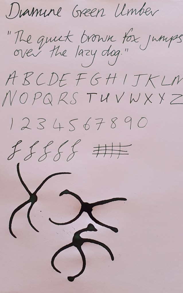
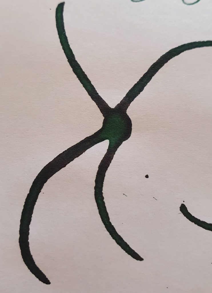
Sometimes the old adage, “it’s not you, it’s me”, really does ring true. That is the case with Diamine Green Umber. There is nothing wrong with this ink, really. It is just a plain, green. It isn’t a dark green, nor is it a light green. I have heard it described as an old earth natural green. Unfortunately, it just does nothing for me. I have yet to experience any real sheen or shading with this ink when writing. In ink splats, a small amount of darker shading can be observed. Definitely not one to use on cheaper paper.
Browny Red Goodness
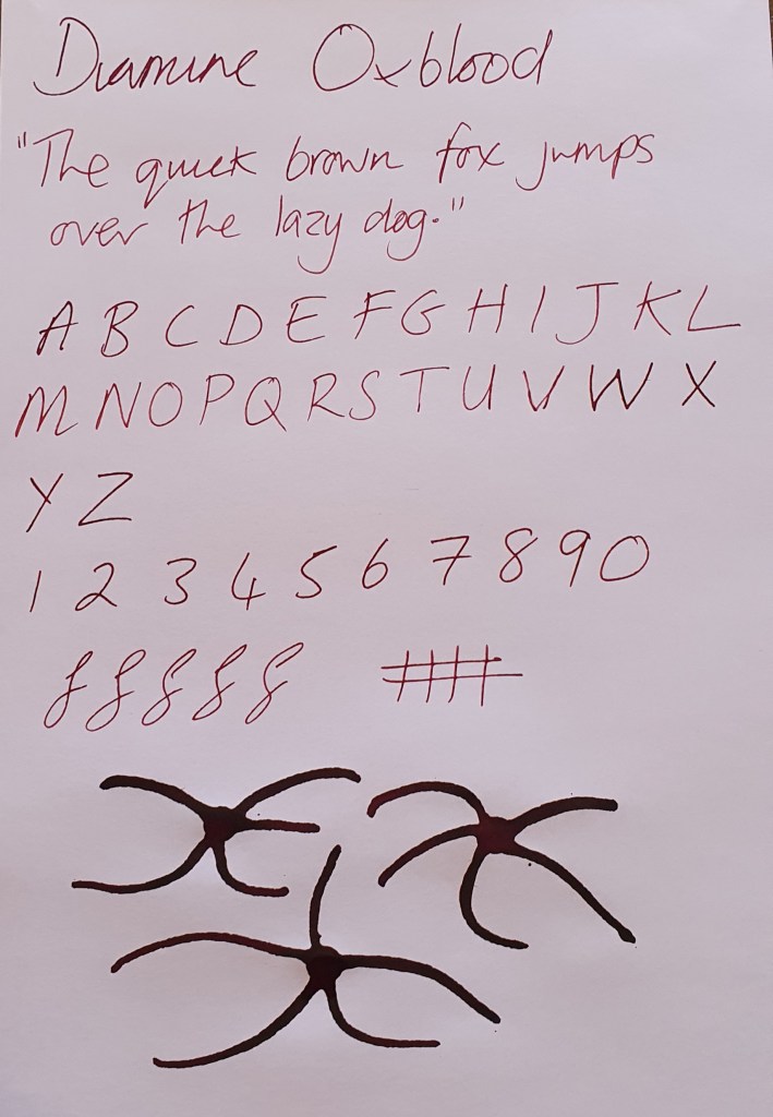
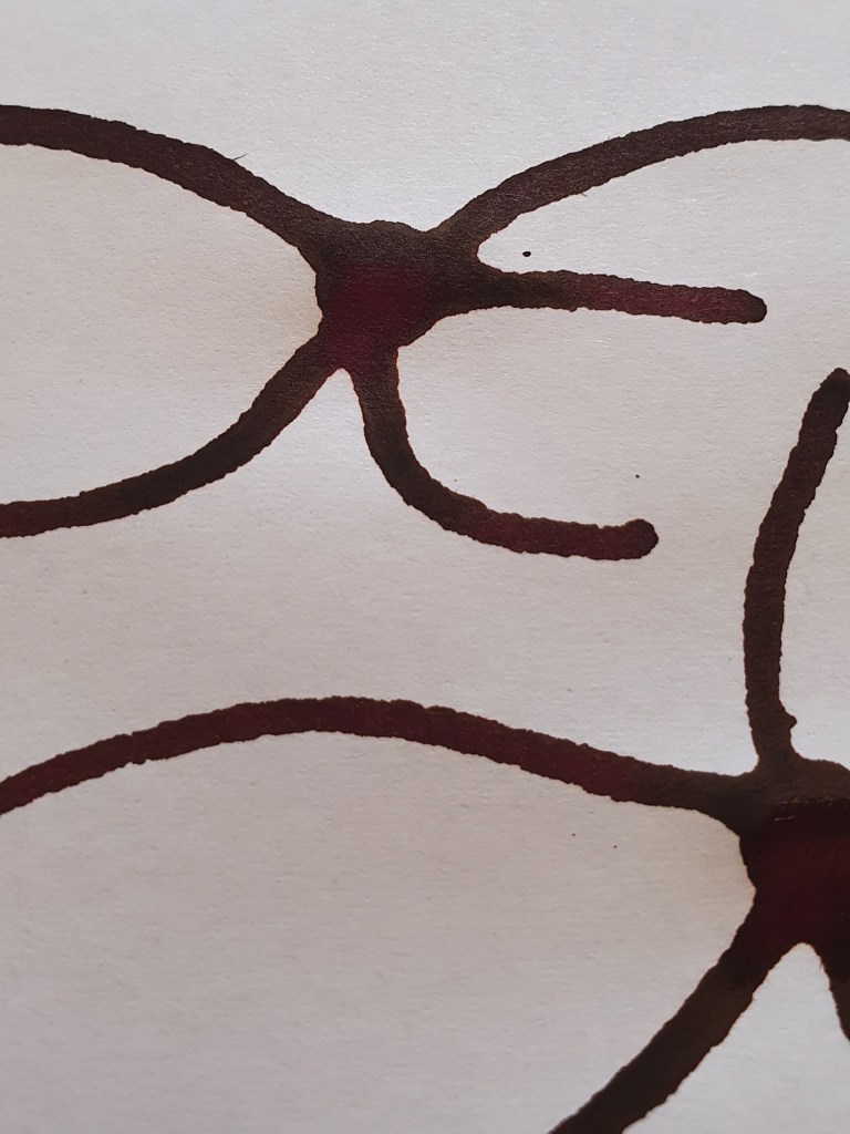
I’ll preface this part by saying that this colour will not be for everyone. You either like this kind of dark red brown, or you don’t. I am a fan. To me, Diamine Oxblood does what it says on the tin. It is a standard Oxblood colour, neither too dark, not too bright. That said, there is a richness to this colour that evokes warmness. This colour can exhibit good shading, from a rich red to a dusky, darker burgundy colour, but it only has a slight, greenish sheen. Well behaved in my experience, but not for everyone.
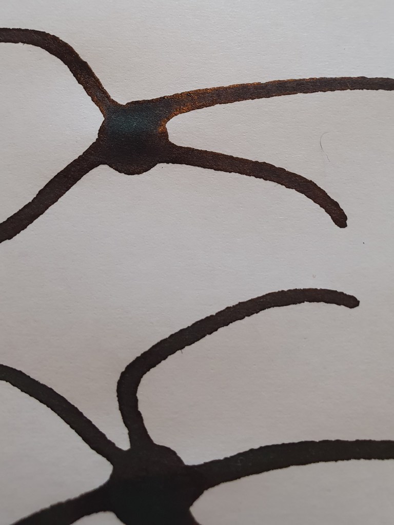
Nominative Subjectivity
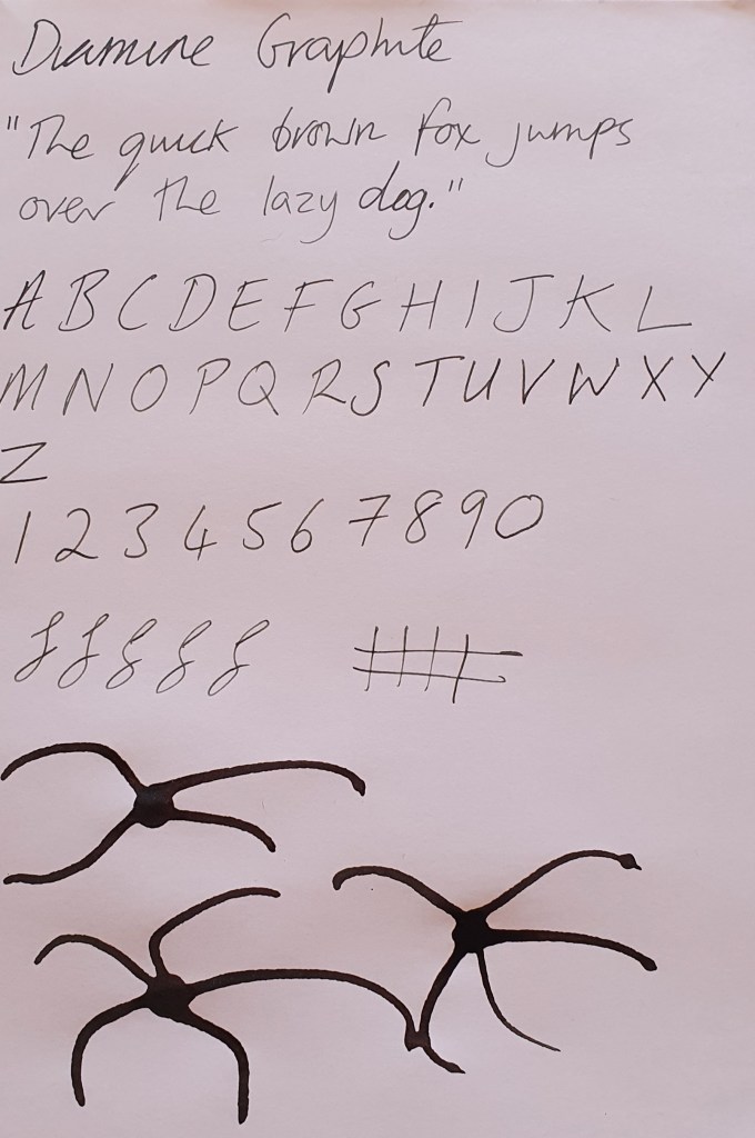
What’s blue to you, dear reader? I bet it will be different to my definition of blue, although we might be in the same ballpark. Diamine Graphite was one of those inks that I bought based on the name alone, when I ought to have read a few more reviews and looked at picture samples (as imperfect as that is). Graphite, to me, is HB pencil grey. There is a greenish tinge to this ink that I just cannot look past. If that’s your bag, then you may love this ink. To me, it was a turn off. Colour aside, or my interpretation of colour aside, the ink performs and behaves well.
Final thoughts
It is always tricky to take the plunge into something new, and choosing ink colours is no different. With literally thousands of inks to chose from, the choice can be overwhelming. But, nothing ventured, nothing gained and you may end up discovering a colour you cannot live without.
